Cake Queens Logo ReDesign
A visual upgrade to represent the new owners
(Artwork © Commercial Digital Print)⮜ Back to Portfolio
After acquiring Cake Queens, the new owners wanted a visual upgrade that better represented their vision of the company. They needed something more sophisticated.
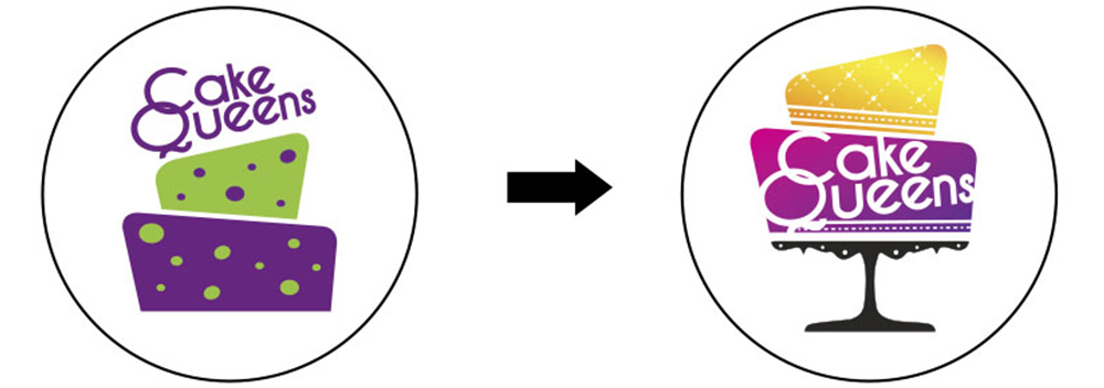
Requested Changes:
- Keep Cake Shape
- Remove all dots
- Add a cake stand
- Keep font the same for brand consistency
- Change colours from 'Barney Purple and Green' to a more royal purple and gold
Delivered to Client:
- Grounded the logo with a simple but elegant cake stand and kept the original shape of the cake.
- All dots removed and replaced with small details to reflect the artistry of creating with fondant.
- Colours changed to incite royalty (high quality) representing a golden crown with purple robes.
- BONUS: Original wordmark kept and moved inside the cake body to increase readability at all sizes and create a more memorable visual
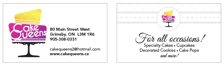
A new logo also meant a new business card!
Check out the new cards for Cake Queens – Clean. Simple. Elegant.
(Artwork © Commercial Digital Print)