Bringing a Vision to Life.
ERA is a brand new business looking to define it's visual identity
OPTION ONE
This design didn't give off the visual impression we wanted. It feels cold, corporate, and expensive instead of warm, welcoming, and historic. Overall this design feels more like an upscale jewelry store rather than a cute vintage shop.
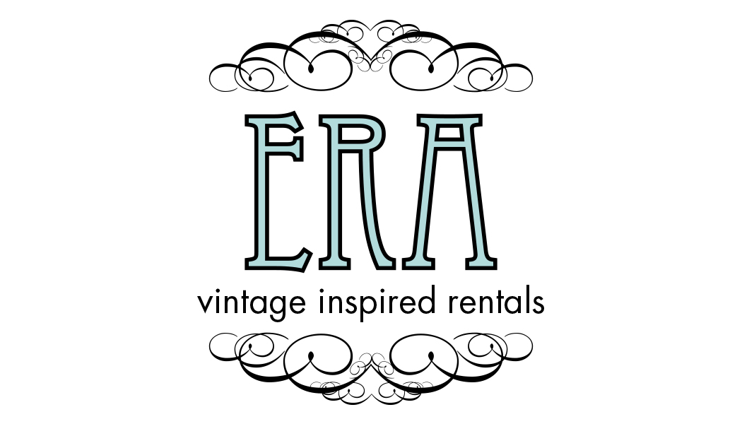
OPTION TWO
The tall letters were an homage to the pillars found on greek and roman buildings with the decorative accents enclosing the design in a nice, neat package. This option proved to be too detailed and would not do well at smaller sizes.
OPTION THREE
Adding a vintage styled frame was definitely a step in the right direction for bringing this brand to life. The client wasn't 100% feeling this font pairing though so we went back to the drawing board.
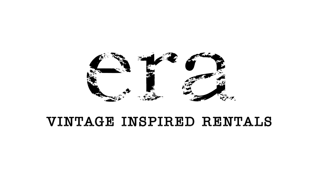
OPTION FOUR
Keeping the company name all lowercase (instead of all caps) gives a softer appearance even with the rough texture added directly to the letters. Changing the tagline font to American Typewriter enforces the vintage feel the client was looking for.
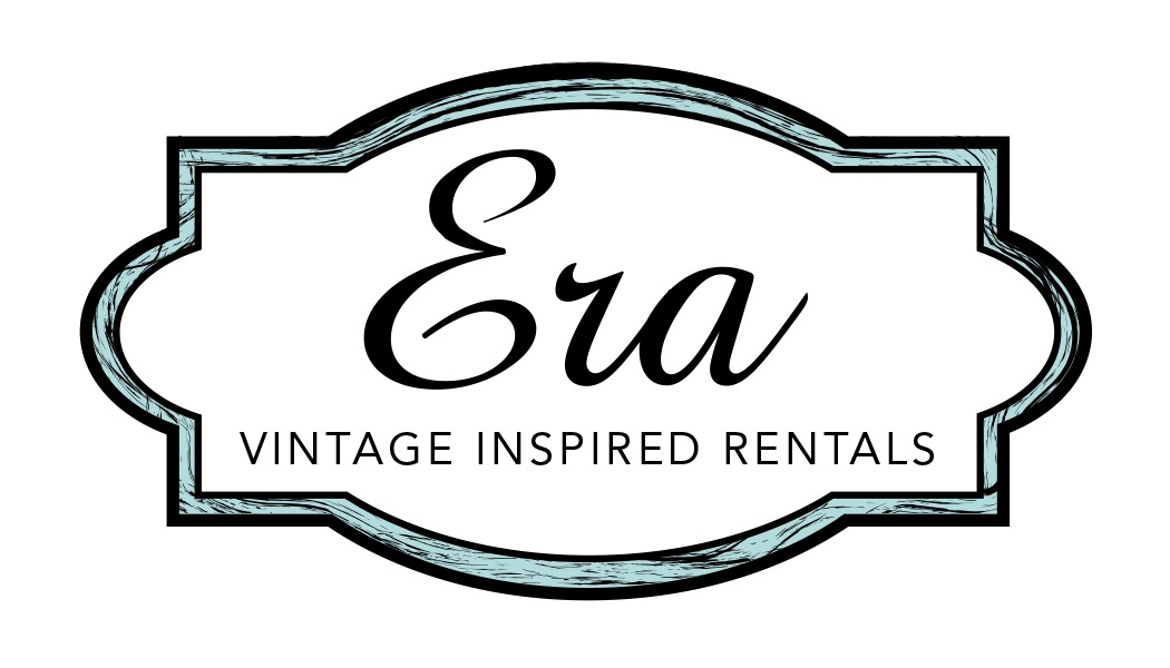
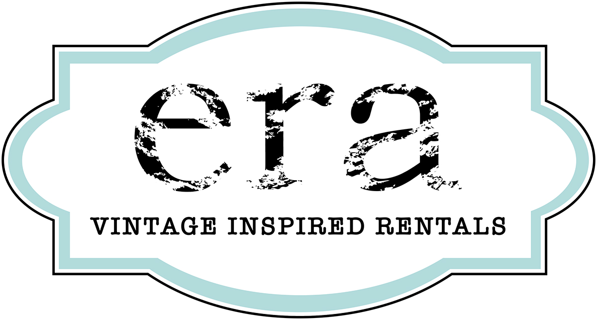
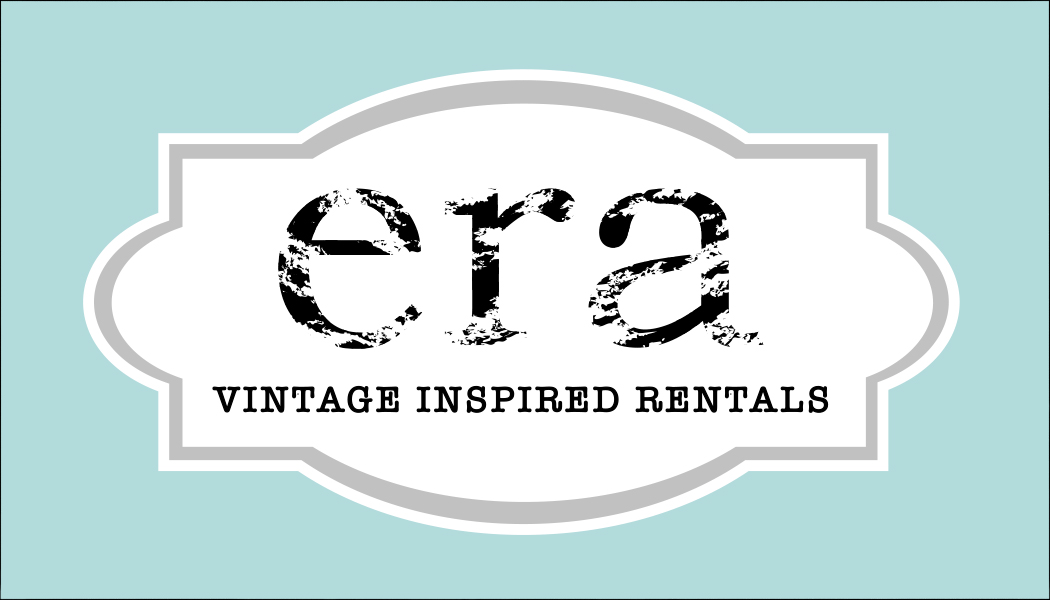
Final Decision
Let's give this brand a face.
The winning design is a combination of Option Four with a clean version of the frame from Option Three.
And that robin egg blue? Beautiful!
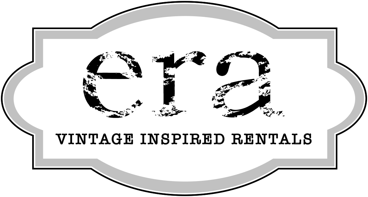
GREYSCALE
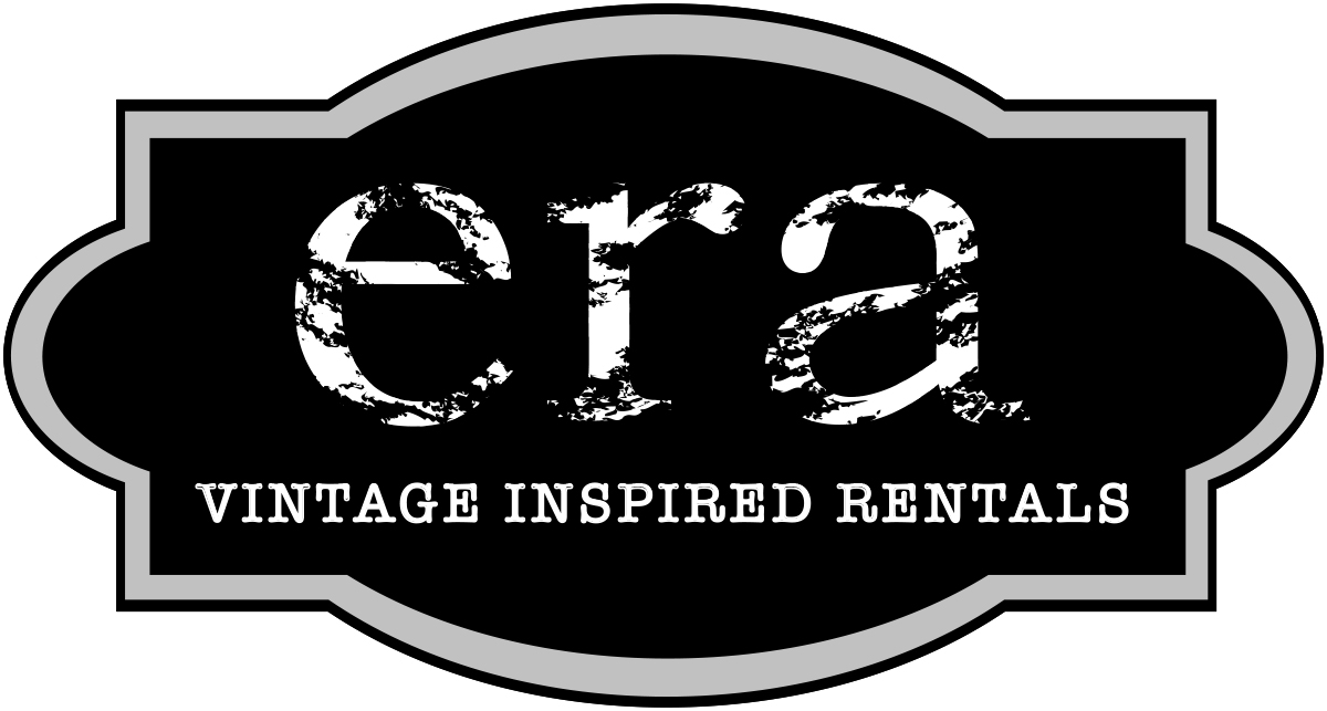
REVERSED GREYSCALE
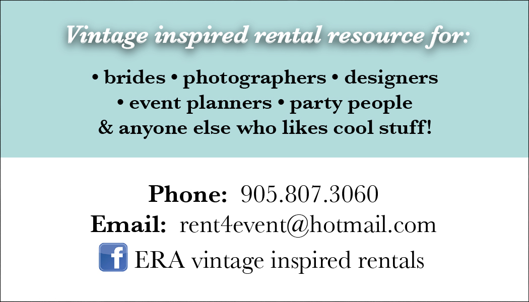
... and a business card to make it official!
FRONT
BACK
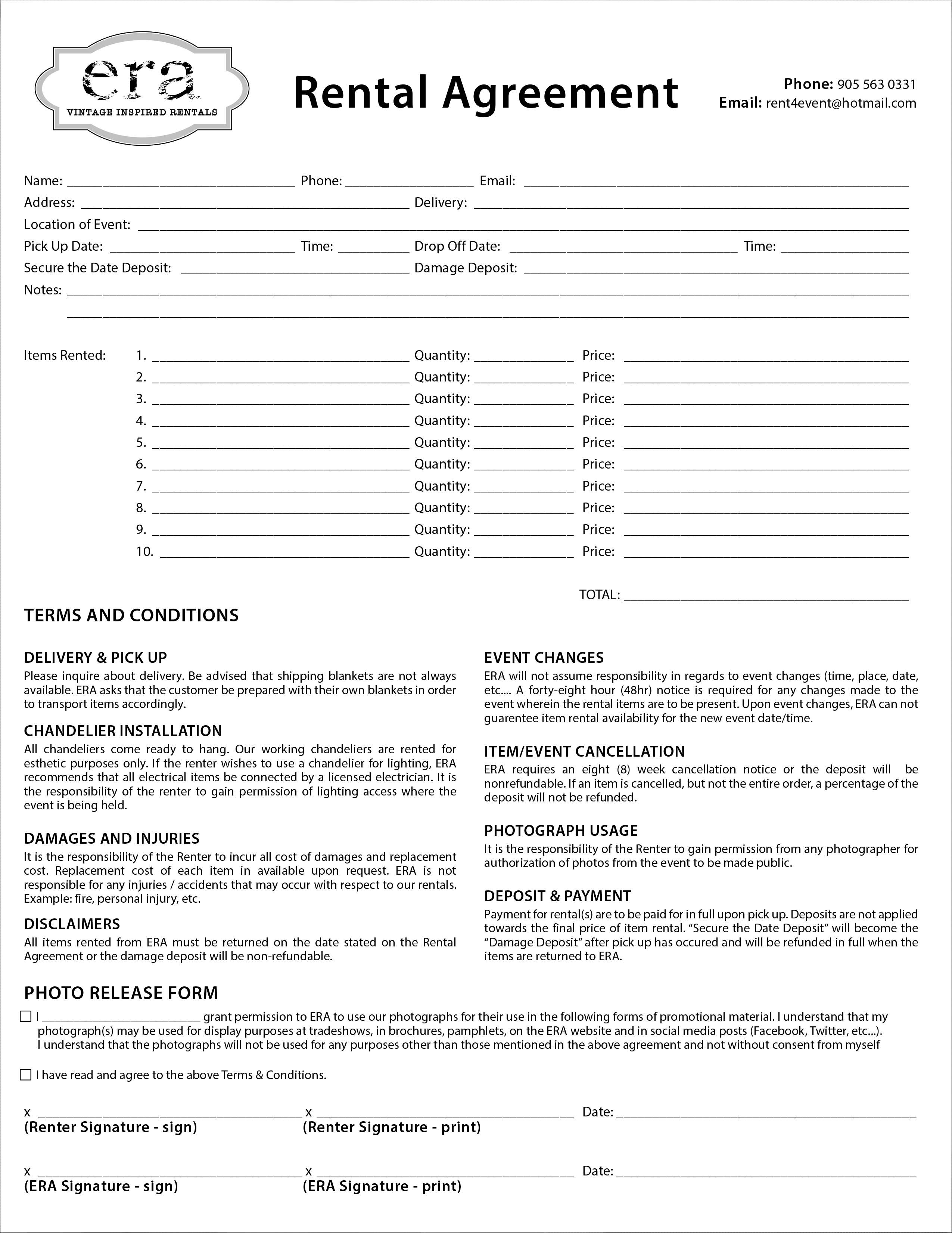
Other Assets
RENTAL AGREEMENT FORM
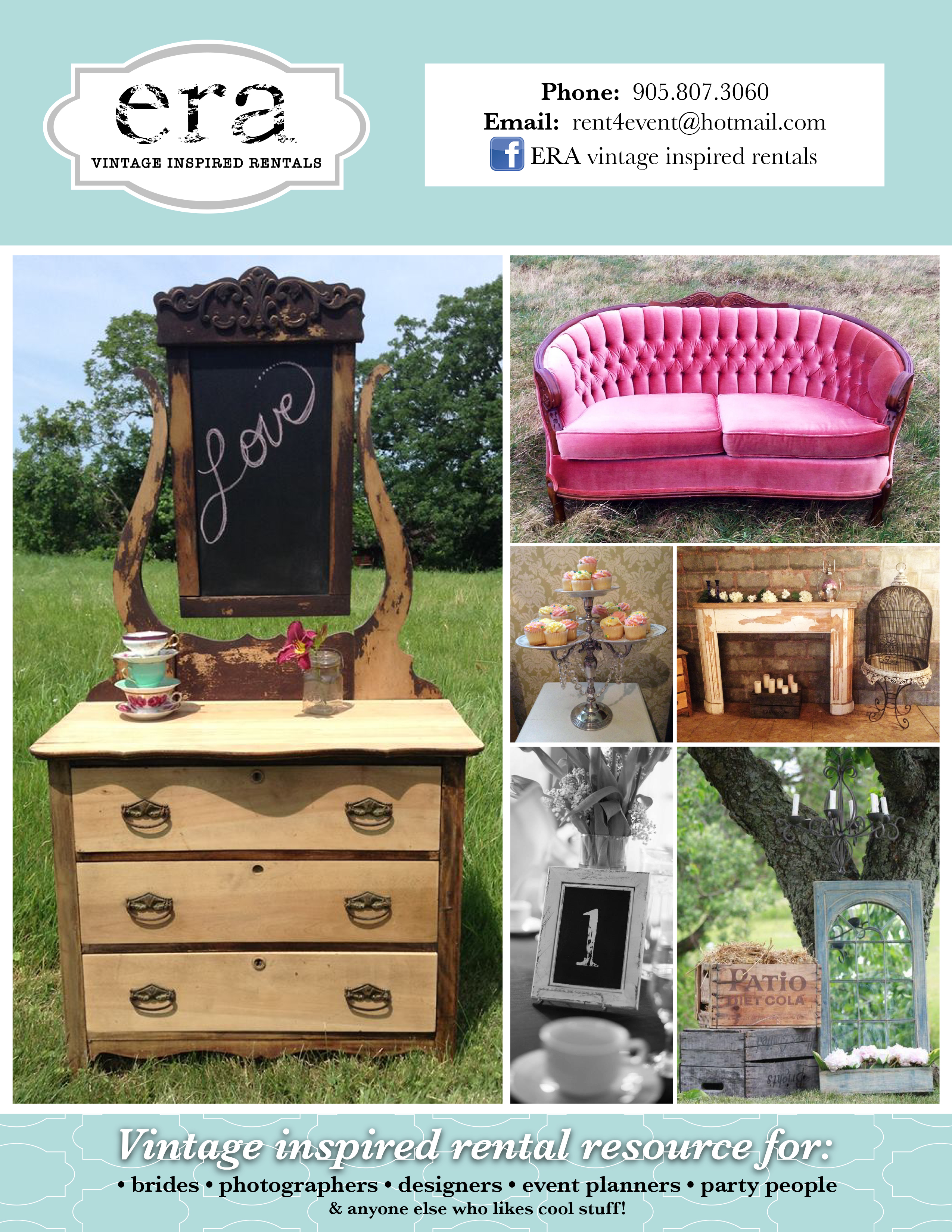
FLYER DESIGN