Good Vibrations Logo Redesign
Redefining the logo to realign with the brand vision.
⮜ Back to Portfolio
Rebuilding a Brand
Here's the logo Good Vibrations needed to evolve from:
• With the detailed elements and the double 'o' possibly being interpreted as rings, this logo is currently giving off major wedding vibes (which is entirely the wrong industry!).
• This design is way too detailed! At smaller sizes, there's no way the tagline is readable and the other fine details would be completely lost.
![]()
... and here's the highlights from the brainstorming session:
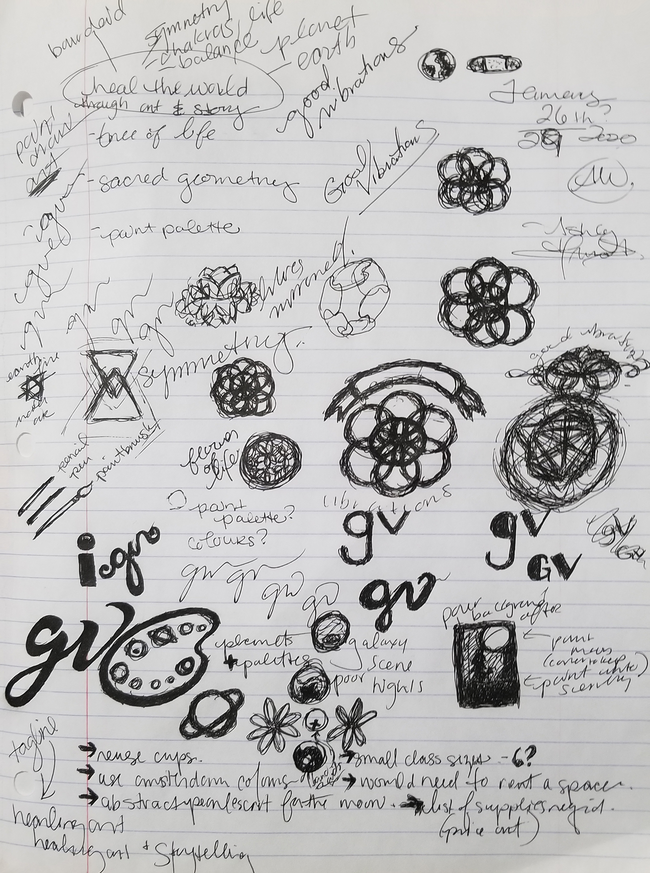
MAIN FOCUS WORDS : Defining a Vibe
What are some keys words that will define this brand:- art and creativity
- helping and healing
- soft, welcoming, inclusive
- good vibes and energy
- growth, expansive, freedom
KEY PHRASES : Possible Taglines
What are some key phrases that will represent this brand?- 'healing art and storytelling'
- 'recognizing magic in others'
- 'art inspired by life lessons'
- 'spreading positive energy through art, word, and accessories'
REOCCURING THEMES/IMAGERY : Visuals
What are some key elements the logo could include?- symmetry, balance, unity (sacred geometry)
- artistry (paint tools)
- healing aids (ie; a bandaid)
- symbols of the universe (planets)
- transformation and growth (butterflies)
Developing a symbol
It's important to explore all types of brandmarks.
Four are shown below. There are also Wordmarks, Mascot Marks, and Dynamic Marks.
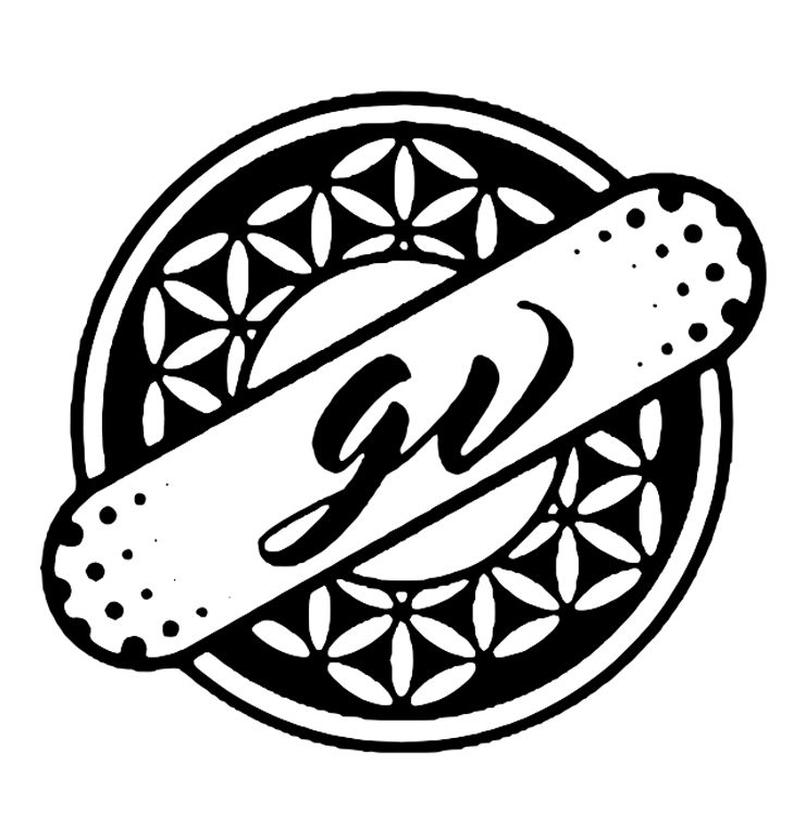
EMBLEM
An emblem logo is when a font is used inside a symbol or icon (ie.: badges, seals and crests).Here we combined some of the ideas listed above: sacred geometry and healing. We used an image of a bandaid with a monogram inside it placed overtop of the Tree of Life symbol.
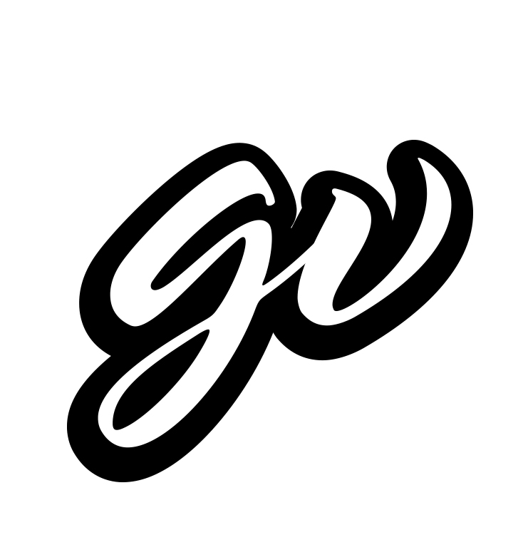
MONOGRAM (LETTERMARK)
A monogram is a typography-based logo created from a few letters (ie.; a company’s initials). When creating this type of logo, simplicity is the name of the game.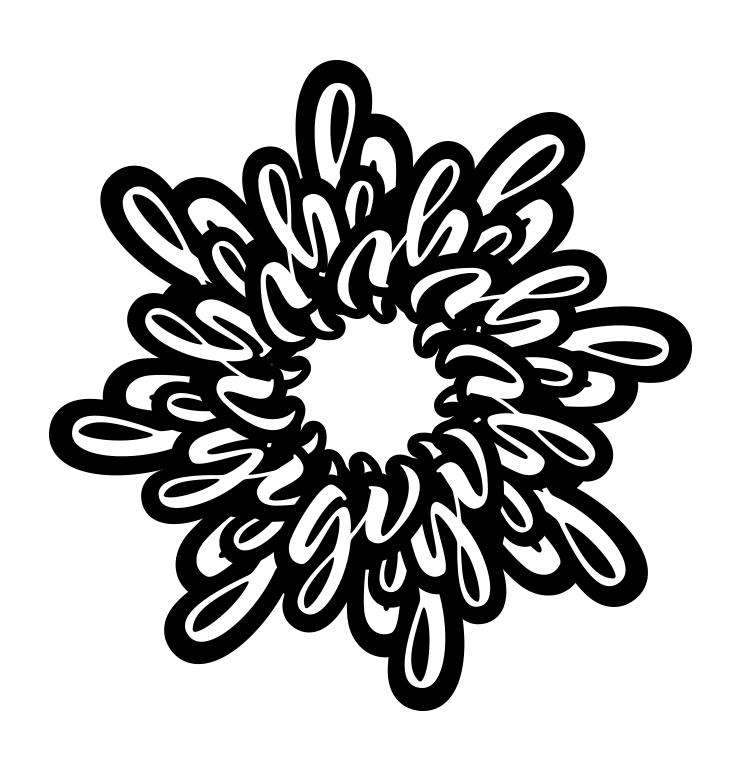
PICTORIAL (ABSTRACT)
An abstract mark is an abstract geometric form that represents your business instead of being a recognizable image.Here we used the 'gv' monogram to form a flower. The final look resembles a Chrysanthemum flower.
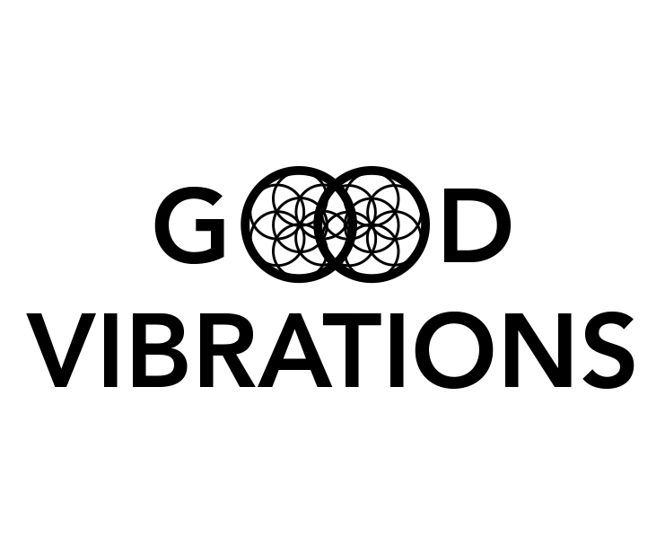
COMBINATION
A combination mark is a logo comprised of a combined wordmark or lettermark and a pictorial mark, abstract mark, or mascot.Here we chose a simple sans-serif font and used the sacred geometry symbol 'Seed of Life' inside both of the O's in 'Good' and overlapped them to further signify unity. The geometric shape gives off a stained glass look.
Refining a Vision
Creating an original symbol that will define the brand.
'The Seed of Life', found at the heart of an ancient pattern called the 'The Flower of Life', symbolizes creation and reminds us of the unity of everything: we are all built from the same blueprint.
Butterfly represents transformation, growth, rebirth, evolution, creation... to become anew.