What started off as a logo redesign turned into a full rebrand
– Logo, Business Card and Website –
(website case study can be viewed here)
Logo ReDesign
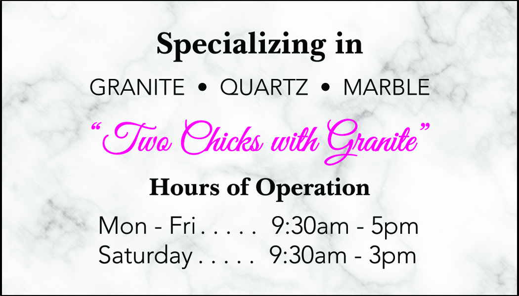
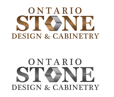
Original Logo:
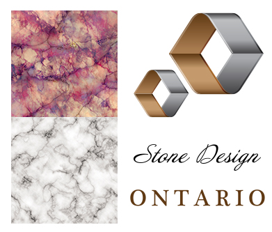
Client Requests:
- Remove brown colour as the company focus will no longer include cabinetry.
- Add marble texture for visual reinforcement of stone and granite.
- Explore adding the colour pink to give a feminine styling.
- Incorporate a border.
Inspirational References:
Design Iterations
A collection of options presented to the client
We provided the above options to the client and after some deliberation, they decided to combine most of option one with the 'stone' from the third option.
Final Design – a logo that is...
• familiar to current customers by using the same shape for the 'o' as in the original logo.
• recognizeable to the industry by using the marble texture in the background.
• and solidified in foundation by using a repetitive square shape to ground the entire design.
To match the new logo, we set OSD up with some new business cards as well!
These were envisioned to be printed on 16pt Cardstock with raised spot gloss covering the logo area on the front and the pink text on the back.