Logo Creation - Stage I
Moodboard - What does SWEET feel like?
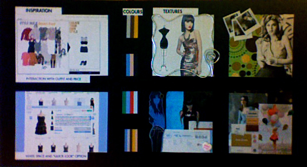
DARK, ELEGANT, EDGY?
This moodboard focuses on darker colour palettes with high contrast and smooth textures.
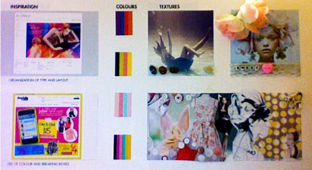
LIGHT, WHIMSICAL, COOL?
This moodboard focuses on lighter and more fun colour palettes with lots of textures.
Logo Creation - Stage II
Preliminary Sketches
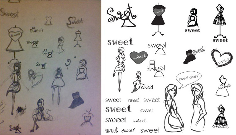
HAND-DRAWN SKETCHES
The initial ideation process started with the exploration of two main visual directions:
- Sweetheart Neckline Shape
- Incorporating a female figure
DIGITAL ILLUSTRATIONS
These hand-drawn sketches were recreated in Adobe Illustrator and further built upon. Different fonts were also explored.
Logo Creation - Stage III & IV
Refinement and Finalization
REFINEMENT
Normally this is where colour palettes would be explored, but for this one it was decided to stay as simple black and white because the rest of the branding materials would be using fun and vibrant colour schemes.
FINALIZATION
This final design was pulled straight from the digital illustrations and no refinements were needed. NOTE: This is an extremely rare occasion!