This was originally a school project, however with time off due to Covid, I made a little time to revisit it
Survey the Visuals
What is the current first impression?
Original Homepage

(Image from 2011)
PROS
It's not all doom and gloom for Blind River - here are some positives about the current site:- Overall design is very clean.
- There is an established Logo.
- A colour scheme is evident (gold, blue-grey, and white).
- The photo is high quality (suggests other images on the site will be as well).
- A testimonial is featured.
- The watermark in the background has been used tastefully - good positioning and set to a perfect opacity strength.
CONS
Overall, this 'Home' page feels more like an 'About' page – here's why:- The logo is at the bottom of the page.
- There are no clear Calls to Actions (CODs).
- The navigation is somewhat hard to read at first glance.
- The block of text makes this page too text-heavy. This is the type of layout you should find deeper in the site.
- The photo is more casual and something expected to accomodate a biography section.
- The testimonial in the corner feels like an afterthought instead of a point of interest.
SOLUTIONS
How we can improve usability:- Move the logo to the top of the hierarchy chain and position it top-left or top-centre.
- The main navigation can be reduced to main categories like 'About' and 'Media'. The word 'Our' can be removed from the navigation titles - its repetitive use is redundant.
- The homepage should feature photos of the winery itself or its' products.
- The testimonial can be larger in size and moved to the main area of the page - we want people to see this!
Redesigned Homepage (Mockup)
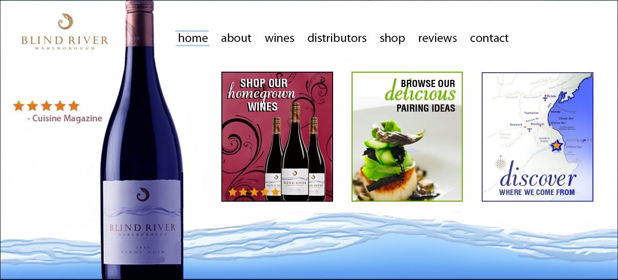
Overall, this homepage is a significant improvment than previous design – here's why:
- Company logo moved to top left
- Featured wine is the biggest, and therefore also the first, thing your eyes will be drawn to. This can change with new wine realeases.
- For the testimonial, a simple star rating was placed beside the bottle. Sometimes a little is all you need! This small visual is unobtrusive to the rest of the design and easily gets the message across.
- The navigation has been broken down into primary and secondary sections (ie; 'About' could have 'About the Vineyard' and 'Meet the Team' as secondary links).
- Three main Calls to Action have been implemented to give the user directional nudges of what to explore next - Shop Wines, Browse Food Pairing Ideas, or Discover more about the history of Blind River Wines.
- The river illustration along the bottom of the page is a nice grounding point for the site and a good use of their current branding assets. A footer navigation could also be added here.